KataCon4–Notes along the way: Part 2

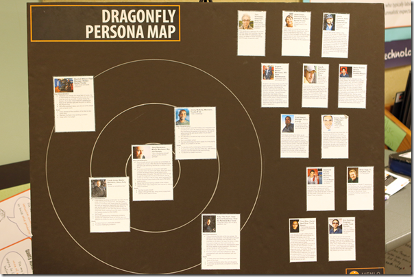
One of the things Menlo does (and I am sure they are not the only ones in their business who do) is create user personas – a biographical profile of a fictional person who represents a category of potential user for the software they are developing.

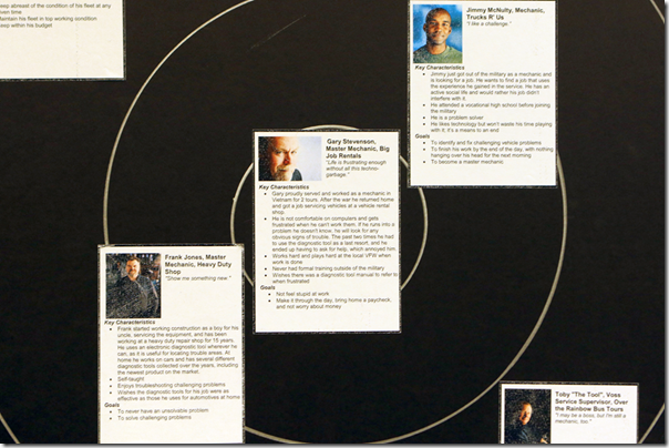
In Joy, Inc, Rich Sheridan describes the often contentious process of then forcing the customer to pick a single persona as the primary user – the persona whose needs will drive all decisions about optimization. That person goes in the center of their three rings.

image

They allow two personas in the 2nd ring, and three in the 3rd ring.

image

As they make design decisions about their code and user interface, they always defer to the innermost rings. That doesn’t mean that someone in a ring further out won’t have their needs met, but they will meet those needs in ways that don’t compromise the process for personas closer to the center.

Persona Mapping for KataCon

In the spirit of being a temporary Menlonian, I worked paired with Craig (over the phone, and in a shared Google Doc) and we developed a persona map for KataCon. Of course, had we done this correctly we would have gone back in time to the previous KataCon, gotten the profiles from the attendees lists, interviewed people, and put together profiles for “typical” people who attend.

Since we couldn’t do that, we pushed past our threshold of knowledge and combined experience with a bit of speculation. I did confirm some of our assumptions via a phone call to Dwayne at Lean Frontiers who graciously answered my questions as he was driving across Indiana.

This process forced us to actually think about who was in the audience, and why they were there – what they were seeking from their participation in the conference. As Rich and I talked about his message, and later on as Craig and I worked on our “Experiential Workshop” we used the names of these “people” rather than generic terms like “participant” or “audience.” I found that really focused our conversations.

Who Do You Optimize Your Process For?

This really begs the general question: Who is your process optimized for?

Is it optimized for the person doing the work?

For the customer’s specific experience? And if so, who is the “customer persona” you are optimizing THAT for? For example, for an ideal retail experience, a mom with two kids in tow would be a different customer than a single guy. You likely get both, but if you have do something that slightly compromises one in order to optimize the other… who is in the center ring?

Next up: Target Conditions as User Stories
Does Your Solution Have A Problem? Does Your Problem Have A Customer?

Javelin.com is a site with a few good tools centered around startup product development. (“Lean Startup”). I really liked their tutorial around the “javelin board” which is a vertical PDCA record specialized for testing product ideas.

In the tutorial, the phrase that really got my attention was this:

“Not all solutions have problems, and not all problems have customers.”

If you are a regular reader, you know one of the questions I ask frequently is “What problem are you trying to solve?” This is especially important if the proposed solution is a “lean tool.” For example, “there is no standard work” is not a problem, per se. I know lots of companies that do just fine, and have more than doubled their productivity before work cycles ever emerged as something to work on. “What obstacle are you addressing now?” is a question we ask in the Coaching Kata to explore the learner’s linkages between the proposed solution, the problem (obstacle), and target condition. The obstacle itself is a hypothesis.

The javelin board process first ensures that (1) you know who the customer is and (2) that you validate that the problem you THINK they have is one they ACTUALLY have… before you go exploring solutions.

Remember as you watch this, though, that the process isn’t different from the Improvement Kata. It is just a specialized variant. The underlying thinking pattern is totally identical… and the problem Toyota Kata is trying to solve is “We have to learn this thinking pattern.” Once you understand the pattern, and apply it habitually, then these variations make perfect sense. On the other hand, if you don’t understand the underlying pattern, then these variations all look like a different approach, and you’ll end up wrestling with “which one to adopt.”

Lego Moonshine

In the Production Preparation Process (3P) we use the term “moonshine” to refer to process of rapid prototyping and iteration. The team creates concepts and tries them out quickly and cheaply in order to learn more.

Today we have some really powerful tools available to do this. One of them is Lego Technic. It is versatile and modular, and you can make machines that actually work.

But the spirit of moonshine means you don’t just think up a complete machine and build it.

Moonshine is a progressive process of adding automation step by step. The final characteristics of the equipment emerge from the process rather than everything being designed from the get-go and just built.

Pushing Innovation

3P – the Production Preparation Process – is often used to develop a complete “reboot” of a process. The term kaikaku is often applied.

Like many of the lean tools, subtle points sometimes get lost in rote application.

Here are a couple of thoughts from some experience:

Developing and Exploring Target Conditions

One of the obvious characteristics of 3P in its early stages is mock-ups of the product and processes. The purpose of these mock-ups is to explore various concepts, gain understanding, surface and propose solutions to problems before anything expensive is actually built.

The result of this process is a fairly well defined target condition.

That is, we understand the performance the product, and the process, must deliver in order to meet the goal. And we know what they need to look like in order to meet those goals.

The mock-ups give much more definition to “how the process needs to work” than any sketch or CAD drawing can provide. They give the team confidence that, at the minimum, they understand what problems must be solved to turn this proposal into reality.

As the 3P continues, these mock-ups should be morphing into functioning prototypes, and finally into full-scale production. At each step there should be a verification that the team is converging onto the goal.

Any time there is divergence from the goal is time to symbolically pull the andon, huddle, reset to a known point, and reestablish a track to success.

Keeping the Solution Space as Wide as Possible

One common mistake that teams make is to focus too quickly on a single solution. This is a result of trying to quickly solve the “big problem” rather than seeking first to gain much deeper understanding.

The evaluation process is not about picking winners. The goal in 3P is to keep as many viable solutions in play for as long as possible.

At each iteration of exploration the team learns what problem must be solved next to keep this solution alive. If that problem seems too big and overwhelming, you are likely working on more than one thing. Time to decompose the process to its basic elements (again) and tackle things one-by-one.

Plan B

While you are exploring alternatives, you always want to have something in your hip pocket that will, as a minimum, work. It might not be elegant, as cheap as you want, but it delivers. Having a viable Plan B in play gives the rest of the team much more freedom to push the envelope and explore.

The Plan B team is working continuously to improve from the baseline. Often they can develop some quite radical improvements. But they always start from something that works.

The beauty of this approach is that elements of the true innovation teams’ work can often be incorporated back into the baseline for even higher performance of the baseline.

Simple and Easy Processes

In the last post I commented on Ron Popeil’s product development approach – to make the product easy to demonstrate drives making it easy to use, which creates more value for the customer.

Let’s take the same thinking back to your internal customers.

What if, rather than just writing a procedure, you had to go and demonstrate it to the people who had to follow it? What if you had to demonstrate it well enough that they saw the benefit of doing it that way, and could demonstrate it back to you to confirm that they understood it? If you broke down the work and organized it to be easy to demonstrate and teach, would it look any different? (Hmmm. TWI Job Instruction actually sounds a lot like this.) Would you still ask “Why didn’t they just follow the procedure?”

Look at the information displays and the controls on your equipment. Do they provide total transparency that things are working? Or do they abstract and obscure reality in some way? Can your internal customer be sure things are going as expected?

Do controls give clear feedback that they are being set correctly? Are sequences of operations readily apparent?

How many “blinking 12:00” situations do you have out there on your shop floor – things that have been put into place, but nobody uses because nobody can really figure it out?

Come back to the design of the product itself. Is the manufacturing and assembly process apparent, obvious, and as simple as you can make it? Would it be designed differently if you had to demonstrate how to fabricate and assemble it?

How about your administrative processes? I recall, many years ago, a “process documentation process” being taught. In the class they were using “baking cookies” as a demonstration example. Yet the instructors, who presumably were experts, actually struggled trying to show how this works. This “process” was far less clear than they had thought it was when they had simply thought through it. “It did not work on TV.”

Look at your computer programs and their user interfaces. What makes sense to a programmer rarely makes sense in actual use. Watch over someone’s shoulder for a while. Could you easily demonstrate this process to someone else?

Ron Popeil cooks real chickens and real ribs in the production of his infomercials. He does not use contrived or carefully limited demonstration examples. As you look at your examples and exercises, how well do they stand up to the real world application? Can you go out to the shop floor and demonstrate your “product” in actual use?

This post is full of questions, not answers. I don’t have the answers. Only you (can) know how well your processes are engineered.

Design your production system (for product or service) as carefully as you would design the product or service itself.

Developing Products to Create Value

I am reading Malcom Gladwell’s somewhat new book What the Dog Saw. It is an anthology of articles he has written for New Yorker magazine over the last few years.

The first chapter is about Ron Popeil, the icon of infomercials and “Set it… and Forget it.” Gladwell describes a fascinating product development slant – make the product easy to demonstrate. In making it easy to demonstrate, its benefits must be obvious. Its features must make it easy to use and simple. Complexity just does not cut it. And it must work, right out there in the open.

The chapter spends a lot of time on the Showtime Rotisserie. In the sales presentation, it is the product, not the salesman, who is made the center of attention. What it can do for you, how easy it is to use, and how it functions. The front is transparent, and angled so the customer can see the product work, in use (and during a demonstration on TV). The controls are simple enough that he can say “Set it… and forget it.” It is engineered (and was re-engineered in development) to prepare visually appealing perfectly cooked food. As it was being designed, it was continuously being used as it would be in a demonstration – the pitch and the product were developed simultaneously.

Because I love examples of opposites, this is the part that really drove the difference home for me:

If Ron [Popeil] had been the one to introduce the VCR, in other words he would not simply have sold it… He would have changed the VCR itself, so that it made sense in an infomercial. The clock, for example, wouldn’t be digital. (The haplessly blinking unset clock has, of course, become a symbol of frustration.) The tape wouldn’t be inserted behind a hidden door – it would be out in plan view, just like the chicken in the rotisserie, so that if it was recording you could see the spools turn. The controls wouldn’t be discrete buttons; they would be large, and they would make a reassuring click as they were pushed up and down, and each step in the taping process would be identified with a big, obvious numeral so that you could set it and forget it. And would it be a slender black, low profile box? Of course not. Ours is a culture in which the term “black box” is synonymous with incomprehensibility. Ron’s VCR would be in red-and-white plastic, both opaque and transparent, or maybe 364 Alcoa aluminum, painted in some bold primary color, and it would sit on top of the television, not below it, so that when your neighbor or your friend came over he would spot it immediately and say “Wow, you have on of those Ronco Tape-O-Matics!”

All of this is about creating value for the customer – value that, in the customer’s mind, exceeds “four easy payments of $39.95.” When that happens, the customer buys the product.

We spend a lot of time thinking about how well manufacturing and supply chain issues are taken into account during product development. But just as important is he customer interface.

Take a look at your product development process. How involved are the people who have to sell it? How involved are customers and users who have to use it, maintain it? Do they get to try out their processes on your prototypes as you go? Or are specifications just tossed over the fence for engineers to figure out and turn into what they think is the ideal product?

Customer Service Opportunities

Today was traveling on behest of a large corporation, so the travel arrangements were made through them. It all went about as routinely as could be expected on the last weekend before Christmas… for me.

Unfortunately the guy I am supposed to meet here had flights going through D.C. that were on a collision trajectory with a snow storm on the east coast today. Flight cancelled.

OK, I need to continue on, then shift my departure out 24 hours – hang around here another day.

Fortunately at the bottom of the itinerary emailed by the corporate travel company is the handy “In case of problems” etc. phone number:

CONTACT xxx TRAVEL 1-800-3xx-xxxx

So I call the number.

A couple of layers of voice menu prompts (including a reminder that airlines are implementing luggage policies, please check your airline’s web site – totally useless information that only delays the response I am trying to get), I end up with the “hold music” being reminded periodically that “Your call is important to us…” etc.

A human comes on the line and I am cheerfully informed that this is not the 800 number I should call. I am reminded that MY reservation was made through the online system (which it was not, I talked to a human being when I made it), and that I need to call “them.” And, kindly, I am forwarded to “them.”

After 20 minutes of hold music, my plane is boarding, so I have to drop the call.

Try again from the seat.

Different initial operator who makes a little more effort to make me wrong for calling the ONLY number that they print on the itinerary they send, otherwise same result. They are closing the cabin door, I have to drop the call.

There actually is a lesson here.

What defines how well a process or system works is not so much the individual components, but the interfaces between them. In this case the “interface,” if you can call it that, is the hapless (and irritated) customer. I am the one who has to integrate various otherwise separate components of this fractured process.

The other story is the reason they were likely so busy today. After all, a major snow storm socked the east coast and caused havoc in the flight schedules that went through there. I am sure there were plenty of people who were impacted, and calling them for assistance re-booking flights, etc. And after all, there really is no way to predict when that will happen so they could be prepared, right? The really cool thing about 21st century communications technology is that you can can not only monitor live weather conditions and radar in real time, if you need to react, “extra people” don’t even need to leave home to be available… they don’t even need to be in the same state or even country. It is possible to plan and prepare for extraordinary mind-boggling never-forget-it customer service, if it is important to you.

In the end, it is about making a conscious decision about the experience you really want your customer to have, and then structuring your processes, deliberately, to deliver that experience – and be sensitive and alert you when they do not. It is not that big a shift from “serving customers” to “customer service,” nor does it cost more in the long haul. “Quality is free” – if you understand how to do it.

Design Innovation Example

This post on the Fastcompany.com blog shows a clever desktop manufacturing invention.

But what really got my attention was the development process that starts at 3:40 in the video. It shows the process of developing it. They may not call it “3P” but, by and large, this is what it looks like.

As they develop ideas, they try them out in simulation, learn, improve, try, learn, improve. As the design matures in stages, they are moving forward, step by step, with concepts that are solid. This process is fast, flushes out problems early, while they are cheap to fix, and fun.

Contrast this with what might be created by a traditional process with the assignment of making a “tabletop NC cutter for cardboard.”

Toyota Museum Display: Universal Design

One of the displays in the Toyota Museum in Nagoya was an exhibition on “Universal Design.” This exhibition runs through December 2.

Rather than trying to interpret and articulate the concepts, I just want to list some of the key words. I think they stand for themselves, and provide a good baseline for evaluating the design of anything which must interact with humans.

  • Easy to see
  • Easy to hear
  • Easy to use
  • Easy to understand
  • You don’t have to be strong
  • Comfortable posture
  • OK for almost everyone
  • Equitable use
  • Flexible in use
  • Simple and intuitive
  • Perceptible information
  • Tolerance for error
  • Low physical effort
  • Size and space for approach and use

The exhibition highlights design concepts and features that make products (particularly automobiles, obviously) .

They talk about the physiological value of the product, in addition to the physical value. This is the linkage between the things which provide physical comfort and accessibility through the things which provide “comfort and peace of mind” – the things which assure the user (driver) that things are OK.

Things which people must see include special attention to the view through aging eyes. I can personally attest that things look different through the eyes of a 50+ year old than they do to a 20 year old. Contrast is reduced, as is resolution. Choices of fonts, sizes, colors are more important.

Even outside of automotive, if you are designing anything which needs humans to pay attention and interpret information, it is important to apply a little thinking into what they (humans) actually see, and what sorts of things penetrate consciousness and get the attention of someone who isn’t that attentive right now.

This carries back to the concepts I outlined in an earlier post “Sticky Visual Controls.” Of course a “visual control” is (or should be) also audible if you want someone who is otherwise distracted (or looking in another direction) to see it.