In this world of laser beams and ultrasonic transducers, we sometimes lost sight of simplicity.
Remember- the simplest solution that works is probably the best. A good visual control should tell the operator, immediately, if a process is going beyond the specified parameters.
Ideally the process would be stopped automatically, however a clear signal to stop, given in time to avoid a more serious problem, is adequate.
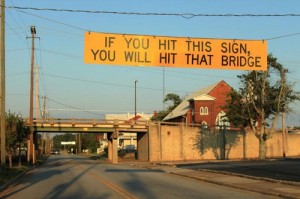
So, in that spirit I give you (from Gizmodo) the following example:

Yeah, it’s ok…if you can read English. Perhaps someone can develop some type of arresting device. Hit this sign and it triggers a spike strip that shreds your tires, or deploys a net (like the crash net on aircraft carriers) that wraps your truck and brings you to a controlled stop, or finally those pipes/poles that pop up out of the ground and will stop you, albeit painfully, on a dime. Damaging the vehicle isn’t desirable but hitting the bridge could be catastrophic.
This is a great reminder of using what works and creating reminders that are understood by almost everyone.
As the people (usually engineers) work to create warnings and education the scope creep and necessity of perceived complexity increases. Because you are smart and have to show a smart solution.
thanks for the post.
My examples are certainly extreme, yes, and perhaps over-engineered and my post wasn’t intended to suggest that the sign wasn’t without its merits. My comments were about the general tendency for over-reliance on visual warnings to prevent potentially serious, even catastrophic, accidents in the workplace. That particular topic is just too much to go in to here so I’ll refrain from hijacking Mark’s blog post with a “blog” length comment.
As for the sign, itself, I wish my old hometown would put up one just like it on Campbell Avenue, both north of Elm Street and south of York Street. It may help prevent a few of the truck vs. railroad bridge collisions that an abundance of “low bridge” signs have not been able to do.
What I liked about the example was that it is not actually a visual warning. The visual is instructing the truck driver how to interpret the loud CLANG he just heard as he went under the sign.
It is, therefore, much more effective than the visual-only “Low Bridge” signs that are found elsewhere, and IMO just as effective as similar systems I have seen using ultrasonic distance measuring and an audible alarm. Obviously it could be improved with symbolic graphics.
But, on the other hand, symbolic graphics could not convey the message so simply and effectively.
With hosts of drivers who are not visually aware of anything but the end of the hood of their car or truck, this sign and the loud sound intruding on their “zone” may be the best of warnings. How many workers do their jobs in a similar “zone?”
Actually it is totally human nature to do the job in this “zone.”
Once people reach a level of skill where they do not have to consciously think of each task as they do it… they don’t. Their conscious mind goes elsewhere. This is the case for amazingly complex tasks.
This is why it is impossible to assure quality or safety by telling people to “pay more attention!” for unexpected conditions or events. It is not that they won’t do it, it is that they can’t do it. Constant vigilance is simply impossible for anyone.