As a general rule I strongly discourage the use of averages and “percent improvement” (or reduction) type metrics for process improvement.
The Problem with Averages
Averages can be very useful when used as part of a rigorous statistical analysis. Most people don’t do that. They simply dump all of their data into a simple arithmetic mean, and determine a score of sorts for how well the process is doing.
The Average Trap
There is a target value. Let’s say it is 15. Units could be anything you want. In this example, if we exceed 15, we’re good. Under 15, not good.
“Our goal is 15, and our average performance is 20.”
Awesome, right?
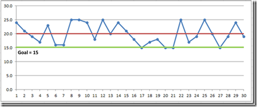
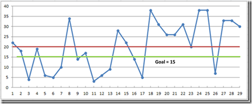
Take a look at those two run charts below*. They both have an average of 20.
On the first one, 100% of the data points meet or exceed the goal of 15.
On the one below, 11 points miss the goal
But the both have an average 5 points over the goal.
In this case, the “average” really gives you almost no information. I would have them measure hits and misses, not averages. The data here is contrived, but the example I am citing is something I have seen multiple times.
Why? Most people learned how to calculate an arithmetic mean in junior high school. It’s easy. It’s easier to put down a single number than to build a run chart and look at every data point. And once that single number is calculated, the data are often thrown away.
Be suspicious when you hear “averages” used as a performance measurement.
Using Averages Correctly
(If you understand elementary statistical testing you can skip this part… except I’ve experts who should have known better fall into the trap I am about to describe, so maybe you shouldn’t skip it after all.)
In spite of what I said above, there are occasions when using an average as a goal or as part of a target condition makes sense.
A process running over time produces a range of values that fall into a distribution of some kind.
Any sample you take is just that – a sample. Take a big enough sample, and you can become reasonably confident that the average of your sample represents (meaning is close to) the average of everything.
The move variation there is, the bigger sample you need to gain the same level of certainty (which is really expressed as the probability you are wrong).
The more certain you want to be, the bigger sample you need.
Let’s say you’ve done that. So now you have an average (usually a mean) value.
Since you are (presumably) trying to improve the performance, you are trying to shift that mean – to change the average to a higher or lower value.
BUT remember there is variation. If you take a second sample of data from an unchanged process and calculate that sample’s average, YOU WILL GET A DIFFERENT AVERAGE. It might be higher than the first sample, it might be lower, but the likelihood that it will exactly the same is very, very small.
The averages will be different even if you haven’t changed anything.
You can’t just look at the two numbers and say “It’s better.” If you try, the NEXT sample you take might look worse. Or it might not. Or it might look better, and you will congratulate yourself.
If you start turning knobs in response, you are chasing your tail and making things worse because you are introducing even more variables and increasing the variation. Deming called this “Tampering” and people do it all of the time.
Before you can say “This is better” you have to calculate, based on the amount of variation in the data, how much better the average needs to be before you can say, with some certainty, that this new sample is from a process that is different than the first one.
The more variation there is, the more difference you need to see. The more certainty you want, the more difference you need to see. This is called “statistical significance” and is why you will see reports that seem to show something is better, but seem to be dismissed as a “statistically insignificant difference” between, for example, the trial medication and the placebo.
Unless you are applying statistical tests to the samples, don’t say “the average is better, so the process is better.” The only exception would be if the difference is overwhelmingly obvious. Even then, do the math just to be sure.
I have personally seen a Six Sigma Black Belt(!!) fall into this trap – saying that a process had “improved” based on a shift in the mean of a short sample without applying any kind of statistical test.
As I said, averages have a valuable purpose – when used as part of a robust statistical analysis. But usually that analysis isn’t there, so unless it is, I always want to see the underlying numbers.
Sometimes I hear “We only have the averages.” Sorry, you can’t calculate an average without the individual data points, so maybe we should go dig them out of the spreadsheet or database. They might tell us something.
The Problem with Percentages
Once again, percentages are valuable analysis tools, so long as the underlying information isn’t lost in the process. But there are a couple of scenarios where I always ask people not to use them.
Don’t Make Me Do Math
“We predict this will give us a 23% increase in output.”
That doesn’t tell me a thing about your goal. It’s like saying “Our goal is better output.”
Here is my question:
“How will you know if you have achieved it?”
For me to answer that question for myself, I have to do math. I have to take your current performance, multiply x 1.23 to calculate what your goal is.
If that number is your goal, then just use the number. Don’t make me do math to figure out what your target is.
Same thing for “We expect 4 more units per hour.”
“How many units do you expect per hour?” “How many are you producing now?” (compared to what?)
Indicators of a W.A.G.
How often do you hear something like “x happens 90 percent of the time”?
I am always suspicious of round numbers because they typically have no analysis behind them. When I hear “75%” or “90%” I am pretty sure it’s just speculation with no data.
These things sound very authoritative and it is easy for the uncertainty to get lost in re-statement. What was a rough estimate ends up being presented as a fact-based prediction.
At Boeing someone once defined numbers like this as “atmospheric extractions.”
If the numbers are important, get real measurements. If they aren’t important, don’t use them.
Bottom Line Advice:
Avoid averages unless they are part of a larger statistical testing process.
Don’t set goals as “percent improvement.” Do the math yourself and calculate the actual value you are shooting for. Compare your actual results against that value and define the gap.
When there is a lot of variation in the number of opportunities for success (or not) during a day, a week, think about something that conveys “x of X opportunities” in addition to a percent. When you have that much variation in your volume, fluctuations in percent of success from one day to the next likely don’t mean very much anyway.
Look at the populations – what was different about the ones that worked vs. the ones that didn’t — rather than just aggregating everything into a percentage.
Be suspicious of round numbers that sound authoritative.
_______________
*These charts are simply independent random numbers with upper and lower bounds on the range. Real data is likely to have something other than a flat distribution, but these make the point.


Great post. It’s so critical to understand variation (common cause vs. special cause) basic SPC, and the danger of relying on descriptive statistics. Always put data points on a graph(s) to understand the “voice of the process”…don’t let medians, percentiles, etc. guide your decision-making process. Donald Wheeler is a great resource for this and his books are overflowing with real examples.
There’s also the trap of only comparing data points to a goal. Goals are often arbitrary.
In the 2nd chart, it looks like there are 8 consecutive data points that are above the mean. Given SPC rules, that would indicate a special cause is present.
Identifying that situation and reacting to it appropriately is more important than overreacting to every up and down in the data (tampering).
Also recommend Wheeler and his book “Understanding Variation” very highly.
Interesting observation on the points above the mean.
Those charts were generated with a random number generator.
They are not, however, normally distributed around the mean. They are simply random numbers with a given mean and max range. So the fact that there are a bunch of them above the mean line may have something to do with the distribution.